Product Design • UX Design • Icon Design • Graphic Design
MYHELTTI
SEILA
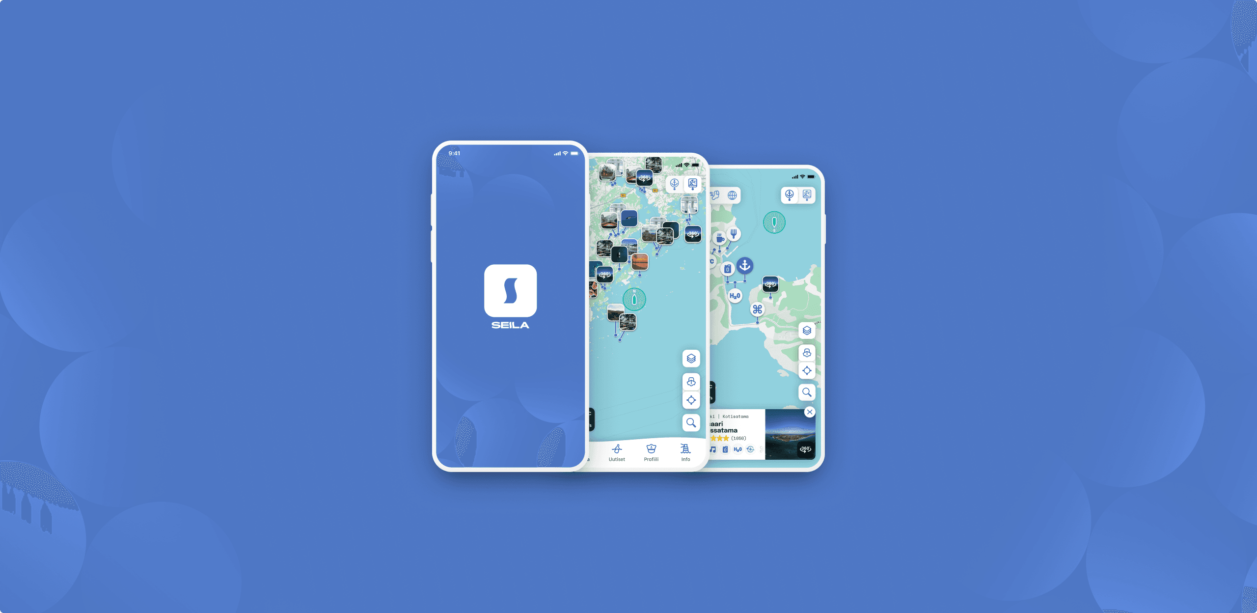
Seila is a mobile-first application designed for leisure sailors navigating the Nordic archipelago. Today, much of the information about marinas and harbors still lives in paper guidebooks, nautical charts, marina websites, and fragmented digital tools.
Seila reimagines how sailors discover the places they visit. Combining practical navigation tools with the inspiration of exploration, Seila helps sailors find not only the information they need, but also the destinations they want to experience.
Roles
Product Design • UX Design • Information Architecture • Icon Design • Graphic Design
Client
Seila
The challenge
The challenge was not simply to create another sailing app, but to solve a fundamental information architecture problem: how to surface the right information in the right format.
Sailors move constantly between practical and leisurely goals: checking the weather, finding fuel, or searching for the perfect marina to end the day. Yet much of this information still lives in paper guidebooks, nautical charts, marina websites, and scattered digital tools, forcing users to switch between multiple sources.
Seila takes a mobile-first approach to marina and harbor discovery, bringing navigation, weather, marina services, and destination information into a single experience.
Every design decision had to account for real-world constraints such as bright sunlight, changing conditions, and the need for information that is easy to understand at a glance. At the same time, the app needed to support both practical needs and the more leisurely side of boating: discovering restaurants, saunas, beautiful scenery, and memorable destinations.
The goal was to create an interface that feels as natural as a nautical chart, as inspiring as a travel guide, and as effortless as planning the perfect day on the water.
How do you help users make confident decisions when planning and navigating on the water?

From essential services to hidden gems, Seila adapts to the sailor’s intent. Icons provide a clear view of what each harbor offers, while imagery captures the atmosphere and experiences that make each destination worth discovering.

KEY DESIGN PRINCIPLES
Seila turns the map from a navigation tool into a gateway for discovery, allowing sailors to switch seamlessly between what they need and where they want to go.
The Approach
I designed Seila around a simple idea: sailors don’t only navigate places, they imagine experiences. The interface needed to support both sides of the journey: making confident practical decisions and discovering destinations that inspire.
The practical mode focuses on marinas and services, surfacing functional information like berth availability, fuel types, waste disposal, and electrical hookups. This mode answers the question: What do I need?
The discovery mode shifts to photography and atmosphere, highlighting restaurants, saunas, viewpoints, and local experiences. This mode answers the question: Where do I want to go?
By allowing users to toggle between these perspectives, Seila acknowledges that maritime decisions are rarely purely practical or purely emotional. They are both. A sailor might start in discovery mode to find an appealing destination, then switch to practical mode to verify it has the necessary services, then return to discovery mode to explore the marina's atmosphere before making a final decision.
The map itself became a canvas for information hierarchy. Essential elements, weather overlays, user position, nearby services remain visible across modes, while secondary information adapts to the user's intent. This approach ensured that users never lost their orientation, even as they explored different aspects of their journey.
Every visual and interaction decision was designed to answer a simple question: How can we help users make confident decisions while planning and navigating on the water?


One of Seila’s most critical design decisions was finding the right balance between practical information and the feeling of discovery.
Users can switch between service icons that reveal what each harbor offers and atmospheric imagery that captures the character, experiences, and sense of place behind each destination.
The ability to switch between practical and discovery modes is Seila's defining interaction.
The ability to switch between practical and discovery modes is Seila's defining interaction. This feature addresses the fundamental tension in maritime apps: the need for both comprehensive data and inspiring experiences.
In practical mode, the interface prioritizes functionality. Marina icons clearly indicate available services through a custom iconography system. Users can filter by essential amenities (fuel, water, electricity, waste disposal) and see real-time availability. The map surface is clean and uncluttered, with information density calibrated for quick scanning.
In discovery mode, the interface transforms and icons give way to photo thumbnails. Users can explore 360° panoramas, browse user-submitted photos, and read descriptions of local attractions. The same geographic space becomes a source of inspiration and atmosphere rather than information.







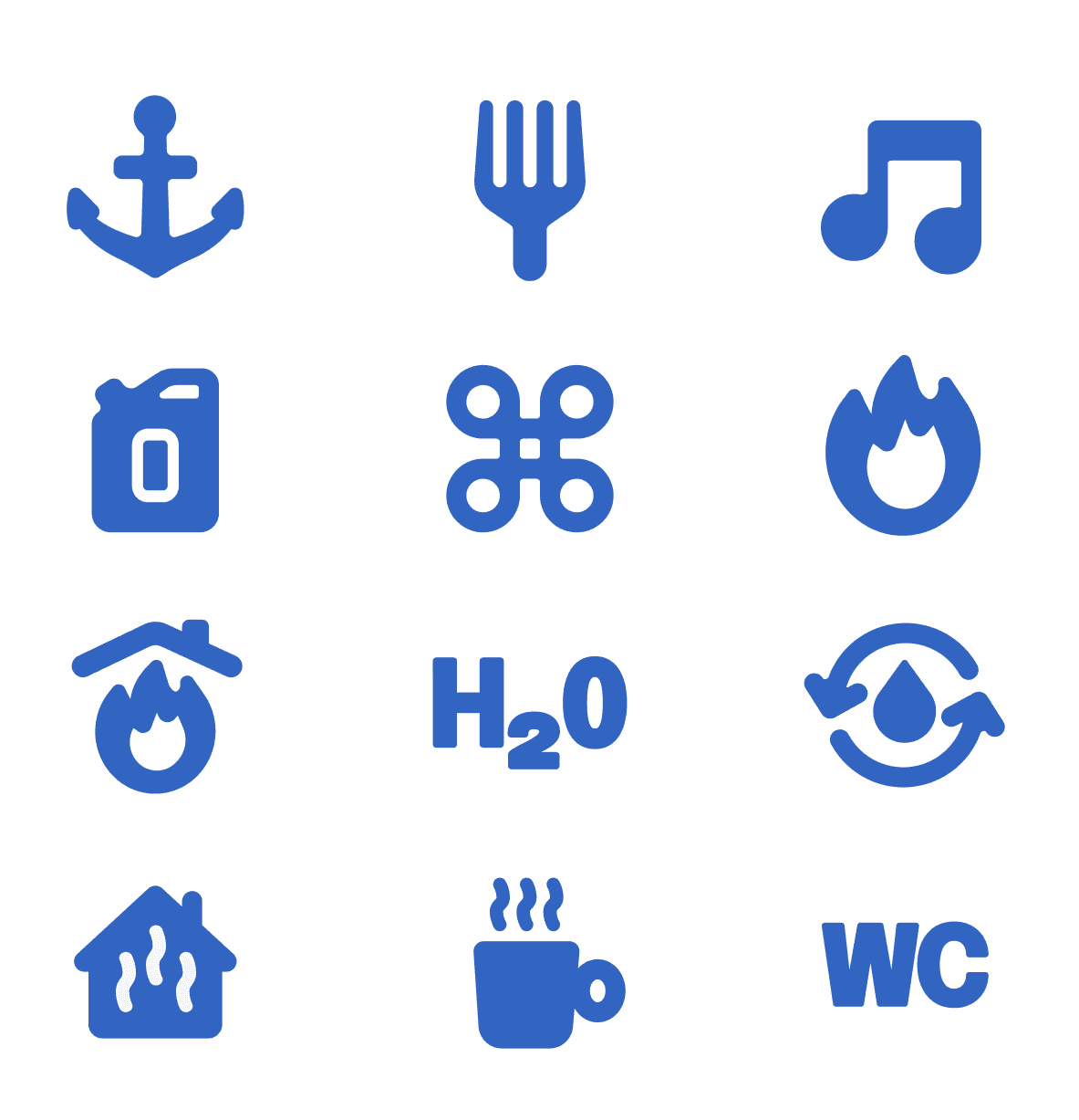
A destination is more than a list of services. Seila’s icon system was designed to make essential information easy to understand while maintaining the sense of exploration that defines life on the water. Each icon translates a practical need into a friendly, recognizable visual language that feels natural within the maritime environment.
Let's continue the conversation
Interested in product design, digital experiences, or building products that solve real problems and people genuinely enjoy using? Feel free to get in touch.
Email: jaakko@officehyvarinen.fi
LinkedIn: linkedin.com/in/jaakkohyvarinen/