Product Design • UX Design • Icon Design • Graphic Design
MYHELTTI
MYHELTTI
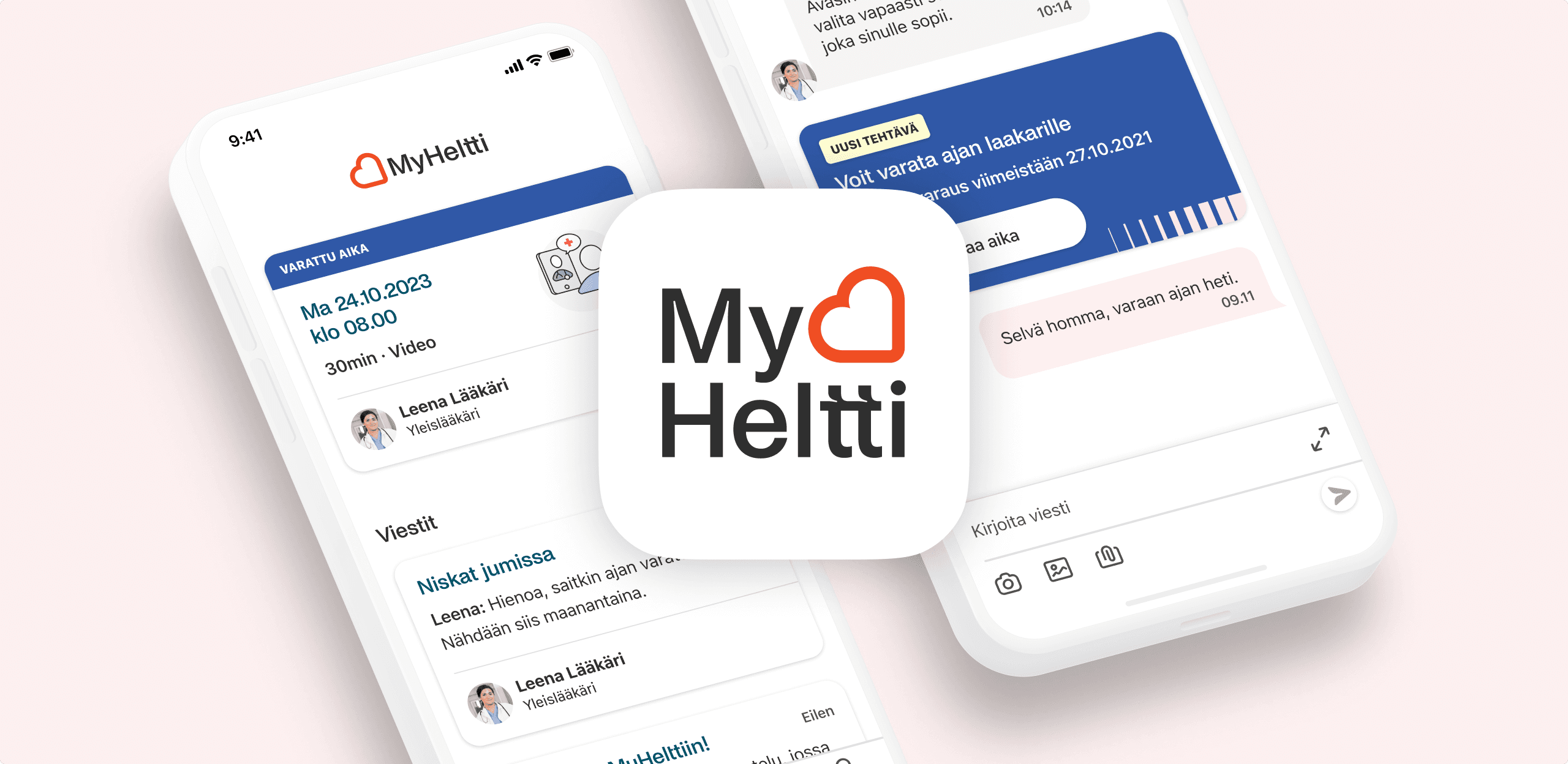
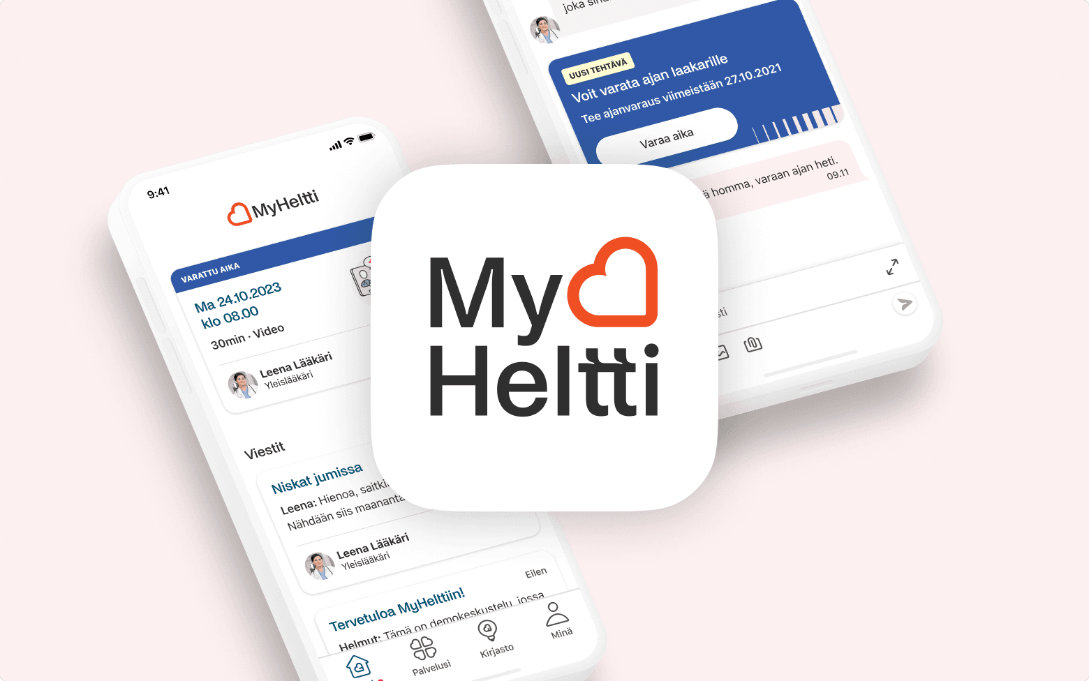
MyHeltti is a digital healthcare platform that brings the entire care journey into a single, easy-to-use experience. Users can book appointments, communicate with healthcare professionals, and access relevant health information through an intuitive interface designed to serve a large and diverse audience.
Roles
Product Design • UX Design • Icon Design • Graphic Design
Client
Heltti
The challenge
MyHeltti needed to support a broad range of users—from young adults to older patients, across different cultures, digital skill levels, and health situations. Some users were booking routine appointments, while others were navigating stressful or uncertain medical issues.
In addition to designing the product experience and UI/UX, the app needed a distinctive visual identity that felt trustworthy, modern, and approachable in a healthcare context. Because the client wanted the solution to remain flexible for potential third-party use, the design was intentionally kept independent from the core Heltti brand. This allowed us to create a cohesive system from the ground up, including the logo, colour palette, typography, and overall visual language, without making the product feel overly tied to a single brand.
The challenge was to bring all of this together into a healthcare experience that felt intuitive and reassuring for everyone, while consolidating the entire care journey—from booking appointments to communication, treatment, and follow-up—into one clear and accessible place.
Creating trust was as important as creating usability. Every visual and interaction decision was designed to make healthcare feel more approachable without compromising professionalism.

KEY DESIGN PRINCIPLES
Lean and clean, never sterile. A healthcare experience that balances clinical trust with warmth, creating an interface that feels calm, approachable, and reassuring.
The Approach
We designed an experience that balanced clinical professionalism with warmth and approachability. Rather than feeling sterile or overly clinical, the interface was intentionally calm, modern, and reassuring, helping reduce friction during moments when users might already be under stress.
A clean visual language, clear information hierarchy, and carefully structured user flows made complex healthcare interactions easy to understand. Friendly illustrations and custom iconography added personality without compromising trust, while thoughtful typography and a restrained color palette improved readability and accessibility.
Every design decision aimed to answer a simple question: How can we make managing healthcare feel a little less stressful?
APPOINTMENT FLOW

Users can continue the discussion and keep track of their care journey without ever leaving the app.
Healthcare interactions often happen when people are stressed, distracted, or uncertain about what comes next. One of the key goals of MyHeltti was to ensure that users always understood their current situation and the actions expected of them.
The app brings appointments, lab results, and tasks directly to the home screen, while communication with doctors and other healthcare professionals takes place through chat. By consolidating the entire care journey—from booking an appointment to discussing results and receiving follow-up guidance—into a single, coherent experience, users always know where to find information and what happens next.
The flow above illustrates how MyHeltti combines proactive communication and guided interactions to make healthcare feel less fragmented and more approachable.


We brought the entire care journey to the home screen, making tasks, lab results, appointments, and next steps immediately visible. By reducing navigation and exposing what mattered most, users could always understand where they were and what came next.


Noi Grotesk by Studio Feixen was selected as the display and headline typeface for its fresh, contemporary character and its ability to feel both approachable and trustworthy—an important balance in a healthcare product. Native system typefaces such as SF Pro and Roboto were reserved for body copy to ensure optimal readability and platform familiarity.
Typography is one of the most powerful tools for shaping a product's visual identity. While many excellent open-source typefaces exist, I often prefer investing in a distinctive commercial display typeface for headlines. Widely adopted free fonts can make products feel visually familiar, whereas a carefully chosen typeface gives a product a more unique voice and helps it stand out. Although commercial typefaces are not exclusive, they are generally less ubiquitous, making it easier to create a recognizable and memorable visual identity.
Typography is one of the most powerful tools for shaping a product's visual identity.
illustrations

The illustration style was intentionally colorful and playful, softening the clinical nature of healthcare and making the experience feel more welcoming without compromising trust. The motifs were closely tied to the product's functionality, making the app feel both personal and instantly recognizable.
In modern digital products, there are only a handful of elements that truly shape a distinctive identity—illustration, color, typography, and the thoughtful use of whitespace. At the same time, the interface itself should remain familiar, following established UI conventions—buttons need to look like buttons, text fields like text fields, and so on—so users can rely on existing mental models rather than learning new interaction patterns.

ICONS

Pictograms
Concept illustrations
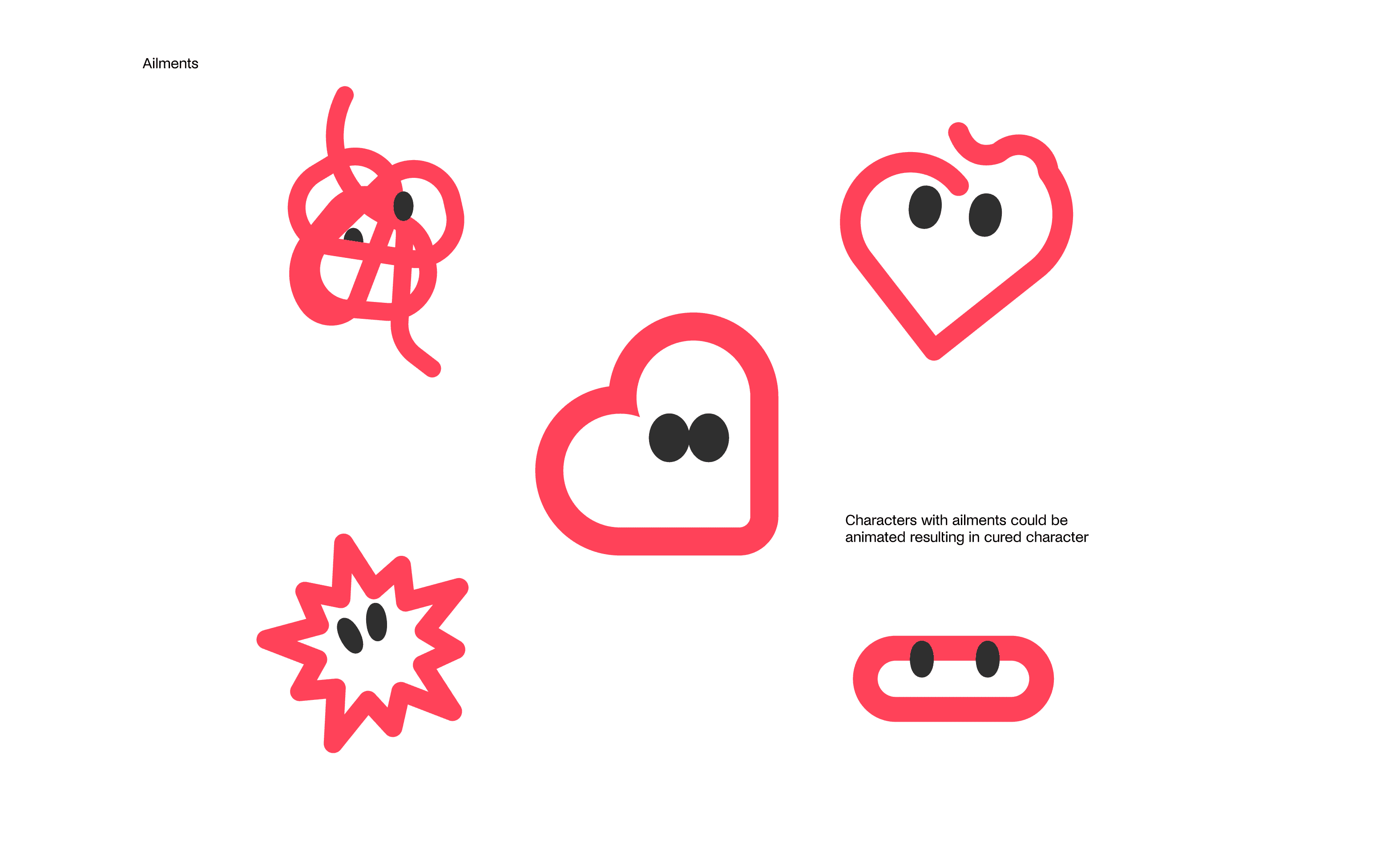
Not every concept made it into the final product. One exploration turned the heart-shaped logo into a simple character with expressive eyes. The idea was for the character to "catch" ailments that users could help resolve by completing small, healthy habits within the app. While the concept had potential to encourage engagement, we ultimately felt it was too playful for a healthcare product where trust and reassurance needed to take precedence. Even so, the exploration helped define the product's personality, and some of its ideas later found a second life on error screens.
Throughout the project, we also experimented with different interaction details to find the right emotional tone. Loading animations ranged from playful heartbeat-inspired concepts to more conventional circular spinners. Each iteration helped us strike the right balance between warmth and professionalism, creating an experience that felt approachable without becoming distracting or frivolous.

Loader OPTIOn 1
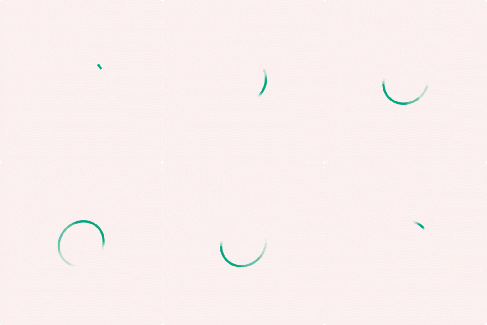
Loader OPTIOn 2

Loader OPTIOn 3
Let's continue the conversation
Interested in healthcare, product design, or building digital products that people genuinely enjoy using? Feel free to get in touch.
Email: jaakko@officehyvarinen.fi
LinkedIn: linkedin.com/in/jaakkohyvarinen/